All Case Studies
Building the Brand System Behind Australia's Growing Business Network
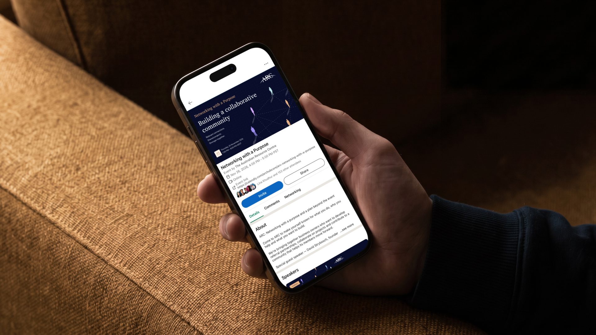
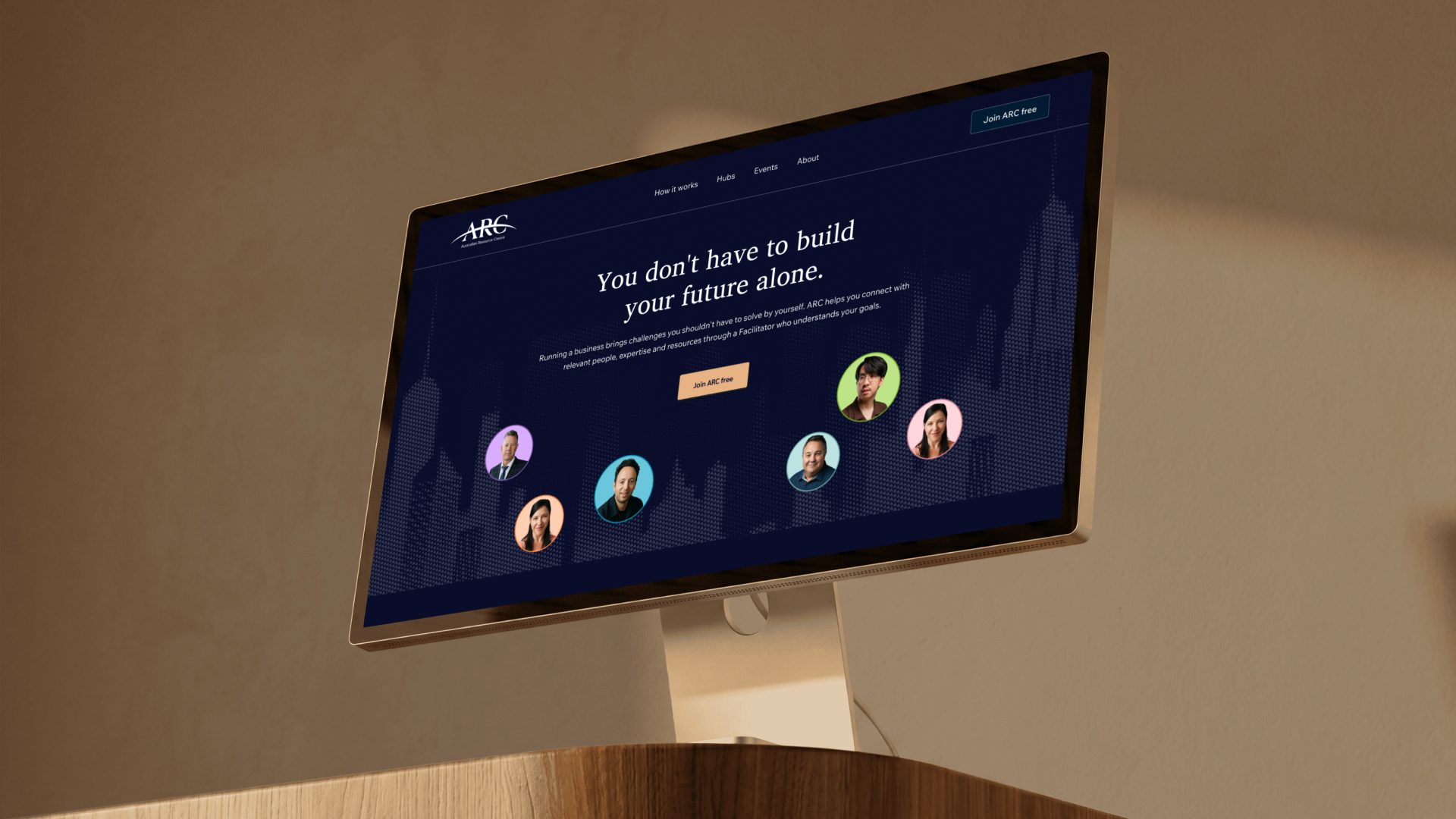
As ARC expanded its network of founders, specialists and business communities, its brand needed to evolve alongside it. Moveforth developed a refreshed identity and practical brand ecosystem that makes the community more recognisable, equips the team to run consistent marketing and event campaigns, and establishes a visual foundation for ARCverse.
Business Context
Australian Resource Centre (ARC) is an Australian business network connecting business owners, founders and community groups with specialists, expertise and resources.
Through dedicated Facilitators, warm introductions and collaborative Hubs, ARC helps members solve business challenges, develop relationships and access opportunities within a growing community.
As the network expanded, ARC was also developing ARCverse, a digital platform intended to bring its wider community and services together.
Original Challenge
ARC's growth introduced a bigger branding challenge. Its identity needed to communicate the value of joining the network while supporting an expanding ecosystem of members, specialist Hubs, events and digital experiences.
The brand needed to address several priorities:
- Establish a stronger market presence: Present ARC as a credible, established business network that people could trust before their first introduction.
- Communicate the community: Make the people, relationships and opportunities behind ARC more visible.
- Support continuous marketing: Give the team a consistent identity for social media, member announcements, presentations and event campaigns.
- Connect the ecosystem: Create a recognisable brand architecture across ARC, its specialist Hubs and ARCverse.
- Prepare for digital expansion: Establish visual foundations that the platform development team could use as ARCverse evolved.
Why the Client Chose Moveforth
ARC needed a brand partner who could translate its growing business ecosystem into a clear identity and a practical system.
The engagement covered the strategic and creative foundations of the rebrand, alongside the tools needed to apply it across ongoing communications and future digital experiences.
The objective was to give ARC a brand it could consistently use as the network expanded, without having to reinvent its visual direction for every new event, community or initiative.
Strategic Approach
The central strategic insight was that people join networks for the relationships and opportunities they offer.
ARC's advantage was its human approach: Facilitators who make introductions, specialists who share expertise, and members who help one another move forward.
We built the brand around three connected priorities:
- Human connection: Make the relationships and people behind the network central to the brand.
- A connected ecosystem: Establish a clear relationship between the parent brand, specialist Hubs and ARCverse.
- A repeatable brand system: Ensure the identity could work across marketing, events, member communications and digital applications.
Creative Solution
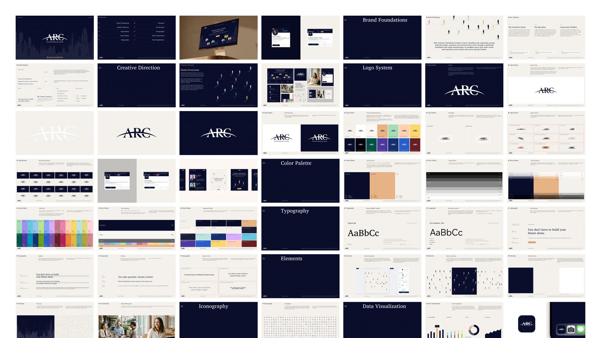
The rebrand retained ARC's existing recognition while giving the organisation a more distinctive and developed visual identity.
The Human Ecosystems direction brought together human figures, interconnected paths and structured compositions to represent the relationships that make the network valuable.
Deep navy and warm gold established a more premium and professional presence, balanced by imagery and visual elements that kept the brand approachable.
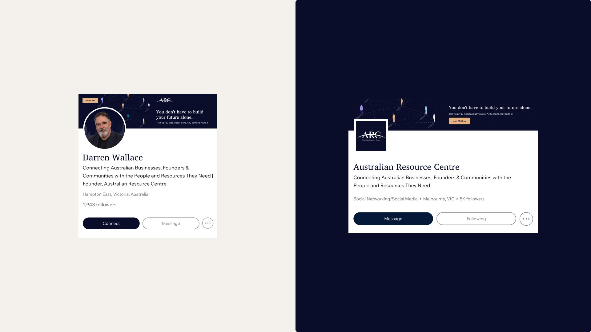
We refined the existing ARC mark and extended the visual language into a broader identity system. The result gave the parent organisation, specialist Hubs, marketing materials and ARCverse a shared creative foundation.
The identity was designed to work beyond brand applications. It became the visual language for how ARC presents its community, promotes its events and develops its digital presence.
6. Practical Systems Delivered
The rebrand extended into the practical systems ARC needs to operate and grow its network.
Corporate Brand & Architecture
- Refined ARC logo system
- Brand guidelines
- Brand positioning and messaging framework
- Parent brand and specialist Hub architecture
- Hub logo and colour framework
Marketing & Event Campaigns
- Social media templates
- Event campaign graphics
- Member introduction and announcement formats
- Presentation templates
- Brand content and communication guidelines
ARCverse Digital Foundations
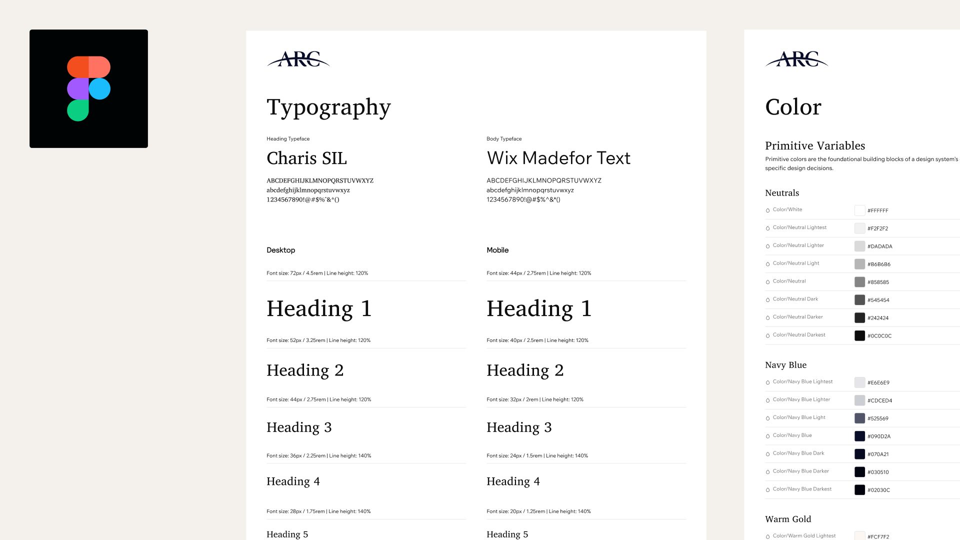
- Figma design system
- Typography and colour variables
- Reusable UI components
- Hub-specific visual foundations
- Digital brand assets for platform development
Brand Operations & AI
- Notion Brand Dashboard
- Organised brand guidelines and asset library
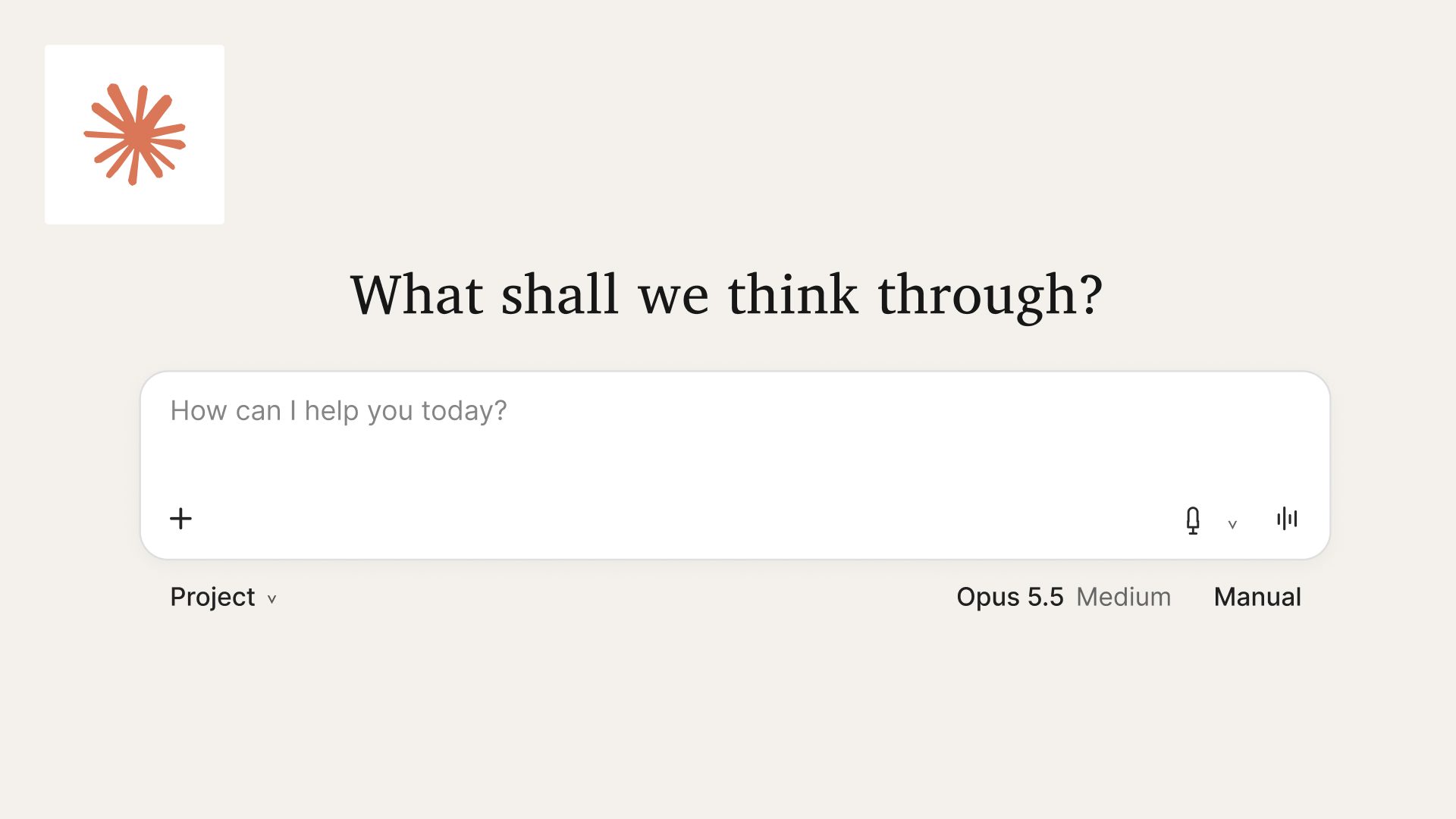
- Claude Brand Assistant configured with ARC's brand knowledge
- Reusable skills for branded content, social media and presentations
- Brand handover and team enablement
Verified Outcomes
A refreshed identity for ARC's next stage.
The rebrand established a more distinctive visual presence while retaining recognition of the existing organisation.
One brand architecture for an expanding network.
ARC, its specialist Hubs and ARCverse now follow a shared identity framework that accommodates future communities and services.
A repeatable system for marketing and events.
Reusable templates give ARC a consistent starting point for event promotions, member announcements, social content and presentations.
Visual foundations for ARCverse.
The Figma design system provides the development team with reusable components and brand references for building the platform experience.
A more accessible brand operation.
The Notion dashboard and Claude Brand Assistant give ARC organised brand resources and AI-assisted workflows for producing future materials.
Delivered in three weeks.
The engagement progressed from kickoff on October 22 to creative direction approval on November 2 and brand handover on November 12, 2026.
Why It Matters
As ARC grows, every new member, event, Hub and digital experience creates another opportunity to strengthen its network.
The brand system gives the organisation a shared foundation for those experiences. Marketing can remain consistent, events can follow an established visual direction, and ARCverse can develop within the same brand ecosystem.
The result is a brand that can support the network beyond its current size, with practical tools that make ongoing brand application easier.


The premium visuals really represent the brand and give it a more credible, professional presence as we grow. It’s great to see ARC developing its own personality.
 Next case study