All Case Studies
Positioning a Precision Manufacturer as a Global Co-Development Partner
As AUTEC Solutions expanded its international ambitions, its brand needed to communicate the value it brought beyond precision manufacturing. Under Darren Lim's creative direction, Jayr Marasigan developed the visual identity, translating the company's co-development positioning into a distinctive brand system for its corporate, sales, exhibition, and digital communications.
Business Context
AUTEC Solutions is a precision elastomer manufacturer serving businesses across medical devices, automotive, electronics, and industrial manufacturing.
Its expertise extends beyond producing seals, rings, and other precision components. AUTEC contributes to product development through materials expertise, engineering collaboration, prototyping, and manufacturing.
With operations connected to Singapore and China and ambitions to serve international markets, AUTEC was building its position around a broader role in the industries it serves.
The company wanted customers to recognize its value as a partner throughout development, from early concepts to production.
Original Challenge
AUTEC had the technical capabilities to contribute much earlier in the product development process, but its brand was primarily associated with manufacturing and component supply.
The challenge was to make its broader capabilities and collaborative role more visible to international buyers.
Strategic Approach
The central direction was to communicate AUTEC as a co-development partner, bringing materials knowledge, engineering capabilities, and manufacturing expertise together to help clients develop better products.
This shifted the emphasis from what AUTEC manufactures to how it contributes to the products its customers bring to market.
The brand needed to communicate three things:
- Technical expertise: Demonstrate the precision, materials knowledge, and engineering capabilities behind its work.
- Collaborative development: Present AUTEC as a partner involved in solving problems and developing solutions, rather than simply fulfilling component orders.
- Global readiness: Establish a consistent corporate identity that could represent the company across international markets and different industry sectors.
Creative Solution
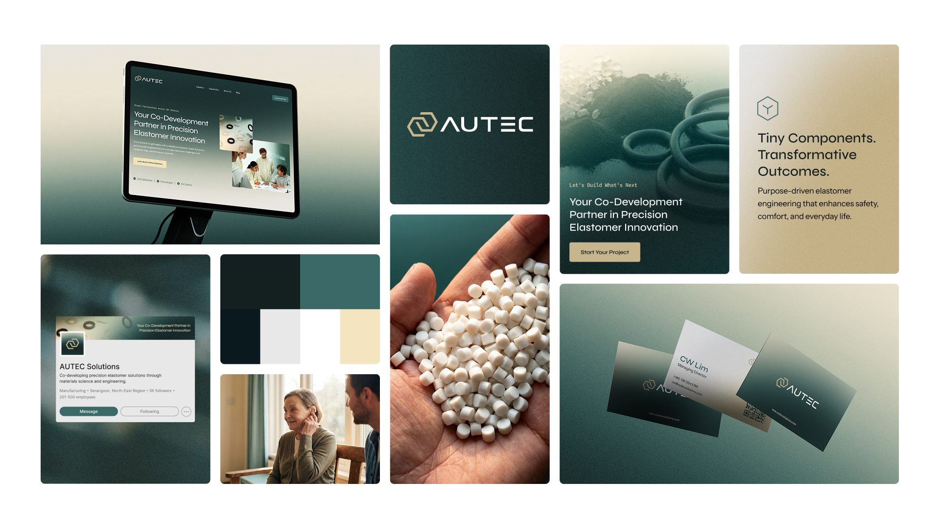
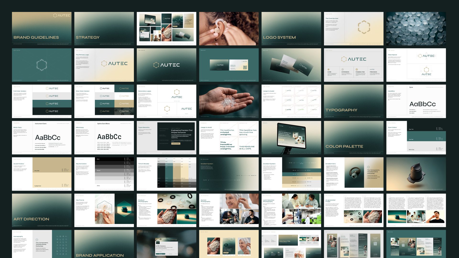
The existing hexagonal reference was reinterpreted into an open, interconnected symbol representing AUTEC and its clients working together. This gives the identity a visual expression of its co-development positioning.
A deep teal palette with controlled gold accents creates a distinctive corporate presence, while a three-tier typography system balances corporate communication with technical specifications and data.
The identity extends across bilingual brand guidelines, photography direction, and corporate applications, creating a consistent visual language for AUTEC's international communications.
Practical Systems Delivered
Visual Identity
- Core logo and custom wordmark
- Primary, vertical, and standalone logo configurations
- Corporate colour system and gradient applications
- Typography hierarchy
- Art direction and photography guidelines
Brand Guidelines
- Bilingual brand guidelines in English and Chinese
- Logo usage and application rules
- Colour and typography specifications
- Photography direction and documented image-generation prompts
Sales and Corporate Communications
- Business card system
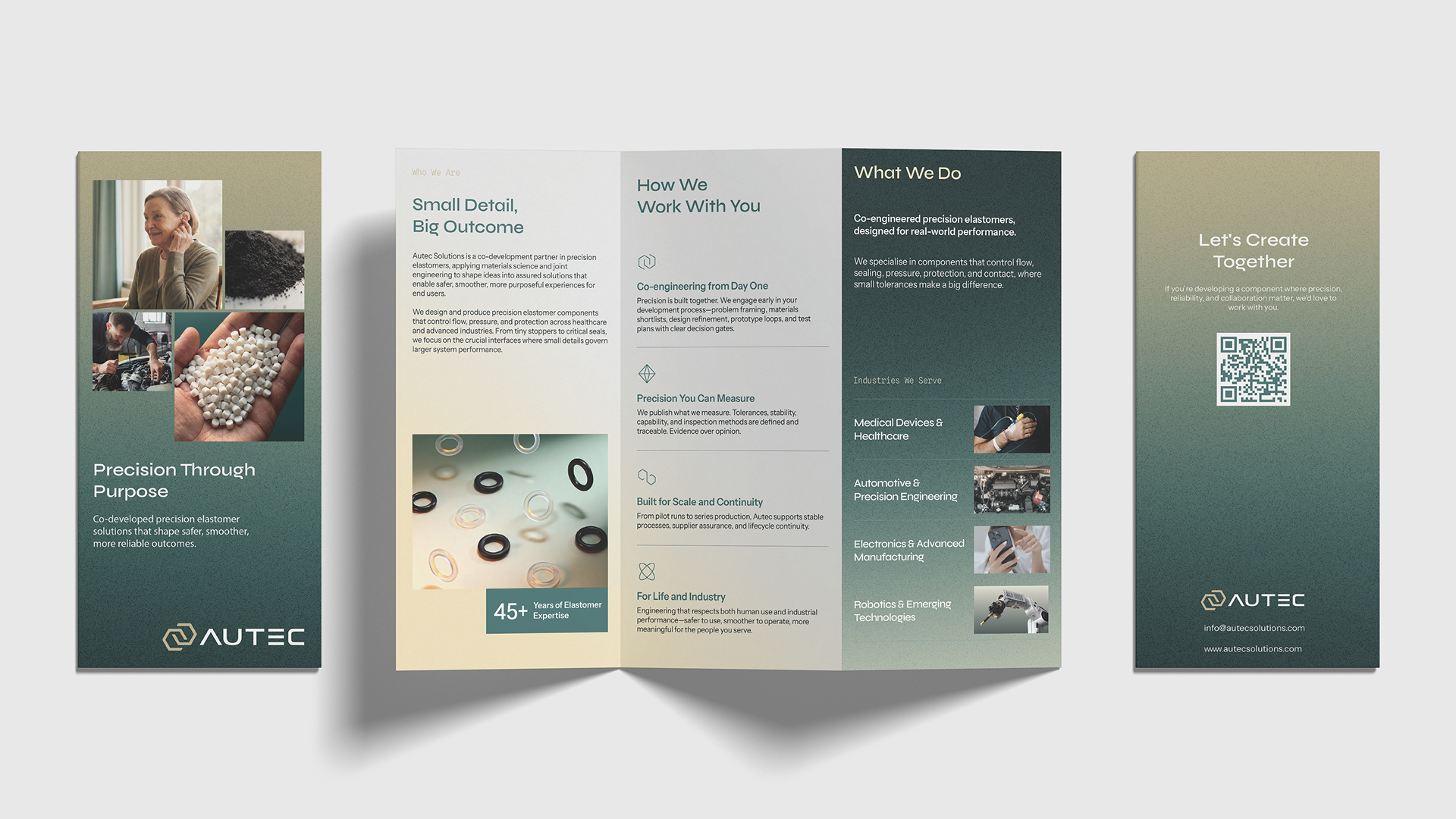
- Z-fold exhibition brochure
- Presentation template
Digital Brand Applications
- Social media profile and cover assets
- Social media design kit
- Website visual direction
Verified Outcomes
A visual identity aligned with the company's intended positioning.
The completed identity translates AUTEC's co-development direction into a recognizable corporate visual language.
One corporate identity across multiple industries.
The visual direction provides a common brand foundation for communications across medical devices, automotive, electronics, and industrial applications.
Bilingual brand documentation.
English and Chinese guidelines give teams a shared reference for applying the identity across markets.
A consistent set of business development materials.
The exhibition, presentation, business card, and digital applications provide AUTEC with consistent materials for introducing its capabilities to prospective customers and partners.
A documented system for continued brand application.
The guidelines establish repeatable rules for visual communication, reducing reliance on individual interpretation when producing future materials.
Why It Matters
For a manufacturer entering international conversations, how the business is perceived influences the opportunities it gets considered for.
AUTEC's expanded capabilities needed to be reflected in every introduction, presentation, and customer touchpoint. The visual identity gives the company a clearer way to communicate its contribution throughout product development.
The distinction matters: AUTEC can present itself around the expertise it brings to its customers, rather than being evaluated solely as another component manufacturer.
 Next case study