All Case Studies
Rebuilding a Property Recruitment Brand and Website With Practical Systems
How we gave a founder-led specialist recruitment firm a distinctive identity, a clearer website, and the practical tools to keep the brand consistent.
Business Context
Property Recruitment Partners is a founder-led specialist recruitment and people advisory firm serving the New South Wales strata and property sectors.
Built on long-standing industry relationships and specialist expertise, PRP prioritizes long-term alignment between employers and professionals rather than simply filling vacancies.
The business had an established reputation, but its brand needed to communicate that expertise more effectively.
Original Challenge
PRP's previous branding work had not delivered the distinctive identity its founder envisioned. The logo felt templated, and the website did not reflect the company's intended direction.
The recruitment category presented another challenge. Competitors frequently emphasized speed, placements, and efficiency, while their visual identities tended toward similar corporate conventions.
PRP needed to look distinctive without sacrificing credibility.
Why the Client Chose Moveforth
PRP engaged Moveforth to translate founder Aaron Petrilli's vision into a coherent visual identity and website experience.
Aaron provided detailed business information, a brand questionnaire, and an AI-generated moodboard expressing the intended direction.
Moveforth used these inputs alongside competitive research to refine the creative approach and develop practical systems.
Strategic Approach
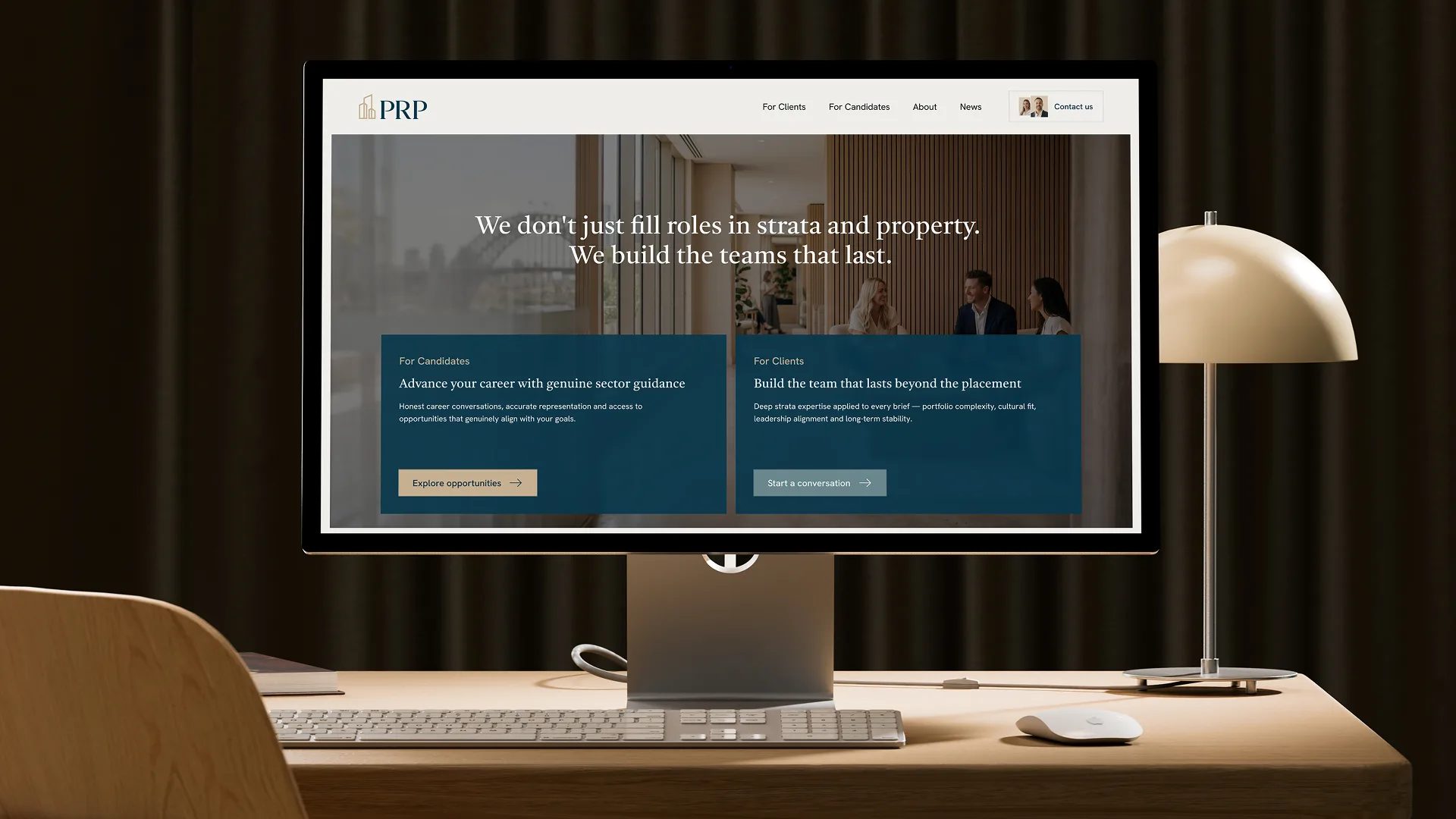
The work focused on PRP's differentiators: founder-led expertise, deep sector knowledge, and long-term relationships. The website and brand needed to serve two audiences.
- Hiring Leaders: Employers seeking professionals who fit their organizations and long-term needs.
- Career Movers: Experienced property and strata professionals seeking relevant opportunities and guidance.
The creative direction emphasized professional credibility, approachability, and the human relationships behind recruitment.
Creative Solution
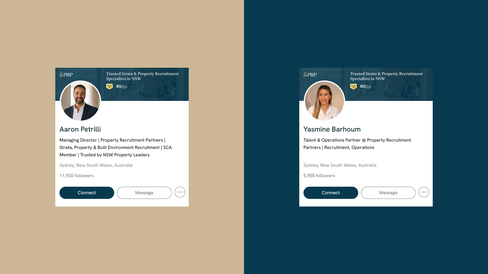
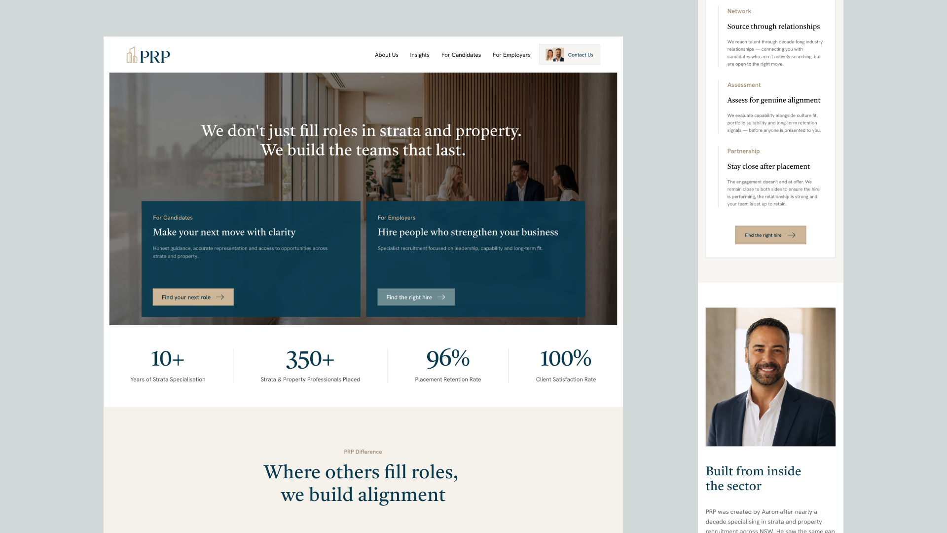
We developed a visual identity balancing authority and warmth. Foundation Navy established a credible professional base, while Warm Sand introduced a more approachable character.
Typography, iconography, and supporting graphics created a consistent visual language.
The website was designed around two audience pathways, helping hiring leaders and career movers find relevant information and next steps.
Practical Systems Delivered
Brand Identity
- Creative direction and visual identity
- Logo, typography, color, and iconography systems
- Brand guidelines
Website & Communications
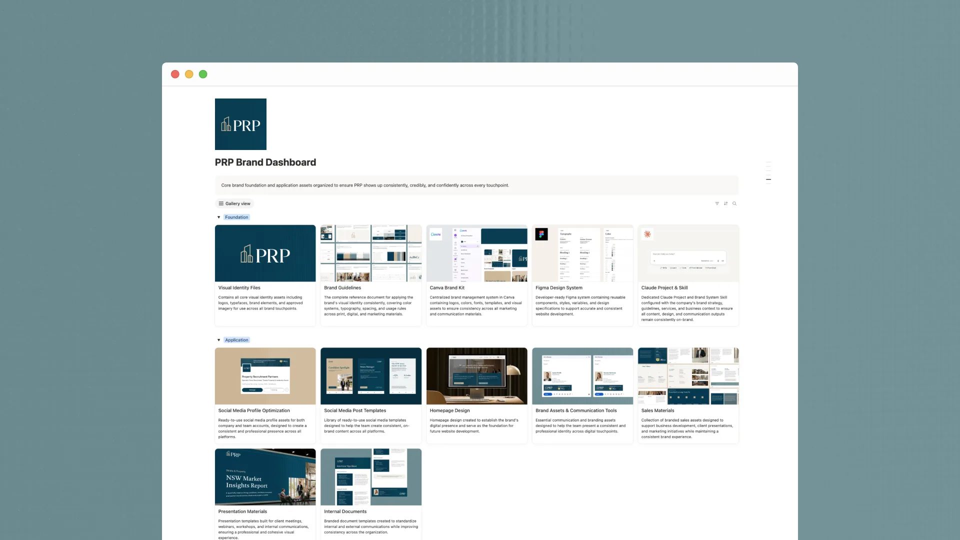
- Website UI/UX and Figma assets
- Canva brand kit and social media templates
- Presentation and business communication materials
Operating Tools
- Notion brand dashboard
- Centralized brand assets
- Custom Claude brand skill
Website development was handled separately by the client's development team.
Verified Outcomes
A distinctive identity: PRP received a cohesive visual system reflecting its specialist approach.
A redesigned website: The website launched with clearer pathways for employers and candidates.
Consistent marketing materials: Social media, presentations, and supporting assets shared one visual direction.
Practical implementation: The team received editable templates, guidelines, and centralized resources.
Why It Matters
PRP now has a visual identity and website that better reflect its expertise and approach to recruitment.
Reusable systems support consistent communication without requiring every asset to be created from scratch.


We really enjoyed working with Moveforth on our brand refresh. They took the time to understand our business, our market and what we wanted the brand to represent. The process felt considered, collaborative and easy to work through.
They brought a strong creative eye, but also a practical understanding of how the brand needed to work commercially. We're really pleased with the outcome and feel the refreshed brand is a much better reflection of PRP today.
 Next case study